
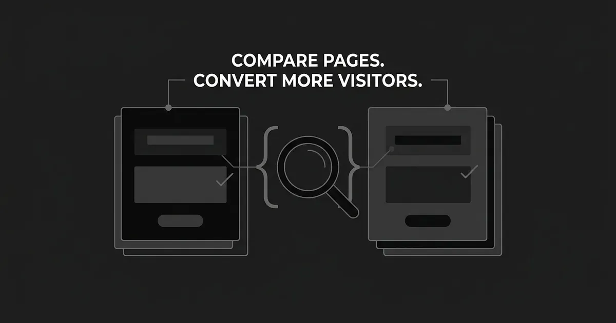
If your campaign page is bringing in traffic but not enough of it turns into a demo request or a signup, competitor analysis for landing pages is one of the fastest ways to find out why. You look at a small set of pages built for the same kind of visitor, compare what they say and how they say it, and use what you find to write a short, testable list of changes for your own page. This guide walks you through that process step by step, from picking the right pages to compare down to testing a change against your own numbers, not a guess about how a rival's page performs.
One thing worth saying up front: a competitor's page tells you what it says and how it is built. It does not tell you how well it converts. You cannot see a rival's conversion rate from the outside, so the goal here is not to copy a page that looks good. It is to find specific gaps between what your page explains and proves and what a comparable page explains and proves, then test whether closing those gaps helps. Done well, landing page competitor research is a short, repeatable habit, not a one-time audit you run once and forget about.
Define the conversion and visitor you are comparing
Before you look at anyone else's page, write down what your own page is actually trying to do. Note the traffic source, who is landing there, what they are being offered, and what you consider a completed action. A demo request is not the same commitment as a free trial signup or a purchase, so be specific about which one you are working on. If there was an ad or an email that sent the visitor to the page, save the exact wording, because you will need it later.
Also pull your current numbers if you have them: your completed-conversion rate for that traffic, and a quality measure that matters more than raw volume, like sales-accepted leads or activated trials. A page that produces a lot of form fills but few qualified meetings is not actually doing its job, even if the conversion rate looks fine on a dashboard.
Write all of this into one short brief. Something like: decision-stage visitors arriving from a demo-focused campaign, primary action is a completed demo request, qualified meetings are the quality check. That sentence is what keeps the rest of the process honest.
Common mistake: comparing unlike outcomes. If your page asks for a demo and a competitor's asks for a free trial, they are solving different problems for the visitor, and a straight side-by-side will mislead you more than help you.
Choose a small, like-for-like set of pages
Good landing page competitor research starts with picking the right pages, not the most pages. You do not need to review every competitor's entire site. Nielsen Norman Group, which studies how people actually use interfaces, treats two to four competing sites as a workable number for this kind of comparison, and that holds here too. More than that and you spend your time cataloging instead of comparing.
Pick pages that ask a similar visitor to take a comparable next step. A rival's homepage is not a fair comparison for your demo landing page, even if it belongs to your closest competitor, because it is not built for the same job. Where you can, follow an actual ad or campaign link through to its destination rather than guessing at the URL, since that shows you the real page a visitor sees, not a generic marketing page.
For each page you include, save the referring message if there was one, the destination page, the date you looked at it, and both the desktop and mobile views. Note anything that seems to change based on device or location. Pages get updated and ads get swapped out, so what you are building is a dated snapshot, not a permanent description of how a competitor operates.
DeepSmith's Content Map is a reasonable way to locate candidate pages across your own site and a competitor's, since it keeps a current map of both. It will not tell you how many visitors convert on any of those pages, and it does not replace actually opening each one and walking through it. Use it to find pages, then do the comparison by hand.

Common mistake: including a page just because it looks polished. A visually strong page aimed at a different visitor or a different offer is not a control, it is a distraction.
Compare the offer and message match
For each page in your set, including your own, write down the promise that brought the visitor there, the headline they land on, who the page seems to be written for, what they actually receive, and any price, commitment, or condition that is stated up front. Then ask a simple question for each one: can a visitor tell what they are getting and why it fits their situation, without having to guess?
Start with your own page first. Check whether your headline actually matches the promise in the ad or email that sent someone there. Unbounce, which studies landing page performance, calls this message match, and it is worth checking on your own page before you look at anyone else's, since a mismatch here quietly loses visitors regardless of what a competitor is doing.
Once you have your own gap, if any, look at whether a competitor states something more clearly than you do: what a demo actually covers, what a trial includes, or what a condition means in practice. You are looking for one or two precise differences you can point to, not a general feeling that their page reads better.
Common mistake: borrowing a competitor's wording or a guarantee you cannot actually back up. A clearer sentence about your real offer beats a stronger-sounding sentence about a promise you cannot keep.
Check the proof against each promise
Every landing page makes a handful of claims: that the product works, that it is worth the visitor's time, that other companies like theirs use it. For each claim on your page and on the competitor pages you are reviewing, note what evidence sits next to it. Is it a specific, attributable result, a named customer, a demonstration, or a verifiable detail, or is it a logo and a line of praise with nothing behind it?
The test is whether the evidence actually supports the exact claim being made. A statement about how fast a product can be set up needs proof about setup, not an unrelated testimonial about customer support. Mark each claim on your own page as supported, needs stronger evidence, or should be softened, and write down what specific proof would move it to supported.
This is also where it is worth being careful. Do not add a competitor's customer story to your own page, and do not write up a number you cannot substantiate just because a rival's page has one. If you use your own customer material, make sure you have permission to use it and that the details are accurate in context.
Common mistake: treating a logo wall as proof. A logo without a specific, relevant claim attached to it does very little for a visitor trying to decide whether this product solves their actual problem.
It helps to physically walk through your page top to bottom and ask, for each claim, "what would a skeptical visitor need to see right here to believe this." Sometimes the honest answer is that the proof exists somewhere on your site but is not on this particular page, which is its own kind of gap. A strong case result buried three pages away does nothing for someone deciding whether to fill out a form right now.
Find the objections your page leaves unanswered
Try to complete your own page's task as if you were the visitor. Before you click anything, write down what you would still want to know: what happens right after you submit the form, what information it is going to ask for, whether there is a cost or a contract involved, and whether the product actually handles your situation. Then check whether your page answers those questions before the moment it asks for a commitment, or only after.
Do the same walk-through on the competitor pages in your set. Their FAQ section or their objection-handling copy is a useful source of ideas about what a buyer in this category tends to worry about, but it is not proof that your buyers share the same concerns. Cross-check anything you find against your own sales calls, support tickets, or anything else that reflects what your actual visitors ask.
Deep IQ, DeepSmith's stored brand and product context, is a useful place to check your answers against before you publish them: your approved claims, your real product details, and what you are allowed to say. It will not tell you which objection is actually costing you conversions on this page, and it will not test which answer works better. That part is still on you.
Pick your top two or three objections, write a clear answer for each, decide where on the page it belongs, and make sure someone who actually knows the answer has checked it.
Common mistake: copying a competitor's language about security, integrations, or cancellation terms without checking that it is true of your own product. An answer that is not accurate is worse than no answer at all.
Test the CTA and form on both desktop and mobile
On each page, find the first clear call to action, note its exact wording, where it sits, whether there is a second one further down, and what actually happens after someone clicks it. Ask whether the label tells the visitor the truth about the next step. Nielsen Norman Group found a case where a vague "Get Started" button drew plenty of clicks from people who were only trying to learn what a service offered, and who then landed somewhere they did not expect. A CTA that gets clicks is not the same as a CTA that sends the right people to the right next step.
Then walk through the form itself, on a phone. Count how many fields a visitor has to fill in, check what happens if they make a mistake, and see whether a failed submission keeps what they already typed or makes them start over. Note anything that would make a visitor give up partway through.
Common mistake: treating a CTA click as a conversion. A click tells you someone was curious enough to try. Whether they went on to complete a qualified demo request or a real signup is a different question, and it is the one that actually matters.
Pay attention to whether the important proof and terms appear before the moment you are asking someone to commit, not after. A visitor who has to click through a form before finding out what happens next, or before seeing anything that supports the claim on your headline, is more likely to abandon than one who saw that information a few seconds earlier.
Turn your observations into a prioritized test list
By this point you have a page full of notes, and this is really where competitor analysis for landing pages turns into something you can act on. Put them into one matrix with a row for each page and columns for the visitor and their goal, the offer, the proof, the unanswered objection, the CTA and form, what you saw on mobile, and a proposed change.
For each note, be clear about what kind of statement it is. There is a difference between what you actually observed on the page, what you think that means for a visitor, and a specific, testable change you could make. "The form asks for a phone number" is an observation. "This might feel like too much to ask" is your interpretation. "Removing the optional phone field could raise completed requests" is a hypothesis you can actually test.
Rank your list by a simple confidence and effort score, high, medium, or low for each. Favor a change with a clear problem on your own page, a reasonable explanation for why it matters to your visitor, and something your team can actually build correctly.
Common mistake: changing the offer, the proof, the form, and the CTA all in the same test. A bundled change can be a legitimate new version of the page, but if several things move at once, you will not know which one made the difference.
Test it against your own conversions and keep a decision log
Before you launch anything, confirm the completed action is actually being tracked, and that the control and the new version are measured the same way. Keep your traffic source and device mix in view so you are not comparing apples to phones. Pick one primary metric, such as completed qualified requests divided by eligible visitors, and use the same denominator every time you check it.
Track the supporting events too, CTA clicks and form starts, so you can see where visitors actually drop off rather than just whether the final number moved. Decide on a test length and a minimum sample size before you start, based on how much traffic the page normally gets and the smallest change you would actually care about. Do not call a winner after a good day or two.
If the page does not get enough traffic for a proper test, that is fine. Gather qualitative feedback instead, make the change based on the evidence you have, and be honest that you are making an informed decision rather than reading a statistically sound result.
Keep a simple, dated log of every test: what the page looked like before, what you changed, who saw it, what happened, and whether you shipped it, revised it, or dropped it. Come back to the competitor pages you tracked every so often, since their offers change too, but keep validating everything against your own visitors, not theirs.
Common mistake: reporting a rise in clicks as a rise in conversion. Those are two different numbers, and only one of them pays the bills.

What to do next
Pick one landing page that matters to your pipeline. Write down its visitor, its offer, and what counts as a real conversion. Find two or three comparable pages, walk through them the way a visitor would, and write down where your page falls short on offer, proof, objection handling, or the path to action. Queue one change, the one with the clearest problem and the most plausible reason it matters, and test it against your own numbers before you move to the next one. This is how you improve landing page conversion with competitor analysis over time: one page, one honest comparison, one tested change at a time, not a single sweeping redesign.
If keeping track of competitor pages and your own approved brand details is the part that keeps slipping, DeepSmith's Content Map keeps a current view of your site and your competitors' sites in one place, and Deep IQ holds your product facts and claims so you are checking a new answer against something real instead of memory. You can try it with a 7-day free trial.