You’ve felt it, right? That gap between “we published a great post about our new feature” and “people are actually… using that feature.” It’s not in your head.
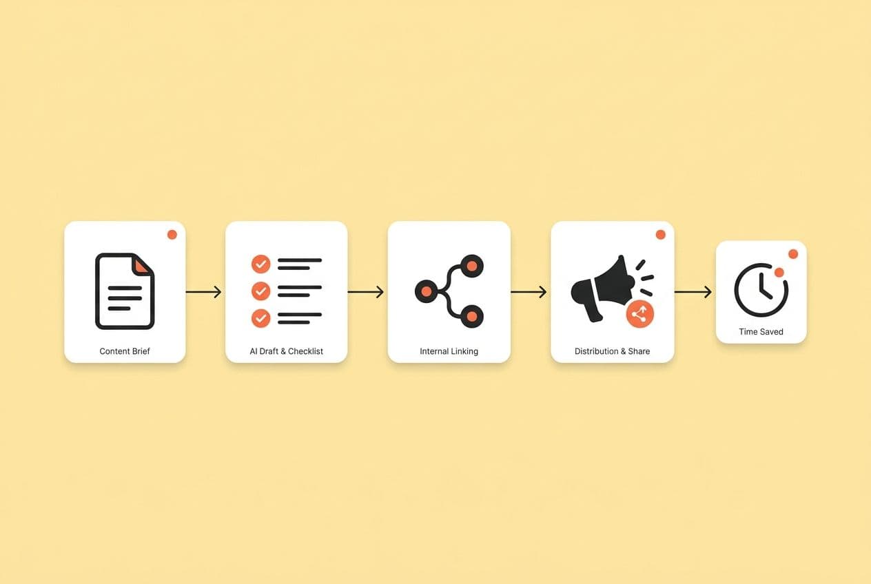
Most SaaS content teams write about features like they’re putting together a brochure. They list what it does, explain why it’s great, and then get frustrated when trial-to-activation rates don’t move an inch. We’ve all been there, running on a hamster wheel of manual briefs, generic AI drafts, and a distribution plan that ends the second we hit “publish.” The posts go live and just… sit there, totally disconnected from the onboarding flow where they could actually help someone.
It’s a recipe for burnout and mediocre results.
But what if your content was a core part of your onboarding, not just a line item in your acquisition budget? I’m going to show you a system for creating “adoption content.” It’s a playbook we built after years of making all the mistakes I just described. It’s not about writing more. It’s about writing the right things, in the right way, to turn features into activation.
The playbook has four parts:
- Choose features using data, not just the latest release notes.
- Write every piece with a repeatable structure that actually teaches people how to do something.
- Match the format to the user’s specific moment of need.
- Measure what matters (adoption signals, not pageviews) so you can get better over time.
This isn’t feature marketing. It’s adoption engineering, built right into your content operation.
What Is "Adoption Content," and How Is It Different From Feature Marketing?
Let’s get on the same page. Adoption content is task-and-outcome documentation designed for real users—people who are already inside or considering your product. It’s not promotional copy written to attract strangers. Its only job is to get someone from “I think this feature might solve my problem” to “I did the thing and it worked.”
Feature marketing talks to a buyer about evaluation criteria. Adoption content talks to a user on a Monday morning who just wants to get their work done. Those are two completely different conversations.
Here's how they stack up:
| Dimension | Feature Marketing | Adoption Content |
|---|---|---|
| Primary audience | Prospective buyer | Active trial user or new customer |
| Core promise | Value proposition ("saves 5 hours/week") | Outcome + method ("Here's how to complete X in under 15 minutes") |
| Proof type | Claims, testimonials, ROI stats | Workflows, screenshots, expected results |
| Success metric | CTR, demo requests, MQL | Feature activation, setup completion, retention signal |
If you’re running a PLG motion, this distinction is everything. When your freemium or trial version is the front door, your content becomes your onboarding engine. There’s no friendly account executive walking a user through their first setup. Your articles, guides, and tutorials have to do that work. Or nobody does.
Even your decision-stage prospects read adoption content, but they’re looking for something different. They’re trying to answer the question, “Will my team actually use this?” Seeing a realistic workflow, complete with prerequisites and notes about edge cases, answers that question far better than a bulleted list of features ever could.
| Asset Type | Goal | When Used | Must Include |
|---|---|---|---|
| Feature page | Discovery + SEO | Top of journey | Use cases, proof, links to deeper content |
| Use case page | Intent matching | Decision/evaluation | Job-to-be-done, workflow overview, social proof |
| Trial guide | Activation | First 30 minutes | Step-by-step, expected results, next action |
| Onboarding tutorial | Setup completion | Day 1–7 | Prerequisites, checkpoints, troubleshooting |
| Advanced playbook | Expansion / retention | Post-activation | Power-user workflows, team rollout, benchmarks |
What "Good" Looks Like: The Adoption-Content Litmus Test
Before you publish any asset aimed at adoption, ask yourself these five questions. Be honest.
- Can a user complete a specific job in under 15 minutes using only this piece of content?
- Are prerequisites spelled out (permissions, data formats, integrations) before step one?
- Are the steps observable? Does the user see a change in the UI or get a clear output at each checkpoint?
- Is there an "expected result"? A screenshot or description of what success looks like?
- Does the CTA match the user's stage? Are you sending them to the next logical task in onboarding, or are you just slapping a generic "book a demo" button on it?
If you can't say "yes" to all five, it's not ready. It’s just more noise.
Which Features Should You Turn Into Adoption Content First?
The biggest mistake I see teams make? They write about what’s new, not what’s necessary. There’s a new feature, the product team is excited, and there's a release post to write. I get it. But the new shiny thing isn’t necessarily what’s causing your trial users to give up and leave.
You need to start with the features that unblock activation.
Pick your battles based on three signals: where users get stuck, what they ask before they buy, and where your competitors are making you look bad.
Four inputs that tell you where to focus:
- Product analytics drop-offs. Where do trial users bail on the onboarding flow? Which features have low activation rates compared to the number of people signing up? Your time-to-first-value data is the most honest feedback you'll ever get.
- Sales and demo call patterns. What questions do your reps get on every single call? If prospects constantly need to understand a specific workflow before they’ll commit, you have a content gap.
- Support ticket clusters. Every "How do I…?" ticket is a tiny signal that your documentation is failing. A cluster of them is a screaming signal for a high-leverage content opportunity.
- Competitive evaluation criteria. Which features do prospects always compare you on? If a competitor is known for their great reporting and you have a strong answer, you need the adoption content that proves it beyond a doubt.
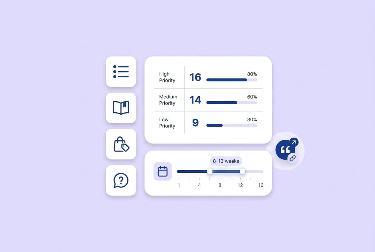
A simple prioritization score (rate 1–5 on each):
- Impact on activation: Does using this feature correlate with users sticking around?
- Frequency of need: How often does a user hit this point in their workflow?
- Complexity/friction: How hard is it to use this for the first time without help?
- Differentiation: Is your version of this genuinely better or just different?
- Reusability: Can this content help multiple types of users or use cases?
Features that score 20+ are your top priority. Anything under 12 probably just needs a standard help doc, not a full-blown adoption content campaign.
Four features to start with, every time:
- First-time setup feature: The one thing that has to work on day one.
- "Aha moment" feature: The one that makes users lean back and say, "Oh, I get it now."
- Integration, export, or reporting feature: The one that lets a user prove the tool's ROI to their boss.
- Collaboration or admin controls: If you have them, these are the features that turn a single user into a team-wide habit.
One last thing: don't write adoption content for dead-end features. If it’s deprecated, super niche, or used by less than 10% of your trial users, a simple help doc is fine. This is a real investment of time and effort, so point it at the features that will actually move the needle.
The 30-Minute Internal Workshop to Pick Your First 5 Adoption Assets
This isn't a three-day offsite. It's a 30-minute, no-fluff workshop.
Before the meeting, pull three lists: the top 10 questions from sales calls, the top 10 most common support tickets, and the top 5 onboarding drop-off points from your analytics. (If you don’t have analytics data, just use the support tickets as a proxy for now).
Agenda (30 minutes):
- List the 10 most common pre-purchase questions (10 min)
- List the 10 most common support issues (10 min)
- Find the overlap. Identify the 5 features that show up on both lists. (10 min)
Output: You should walk out with five job stories, one for each asset. They should follow this format: "When I [context], I want to [job], so I can [outcome]." For example: "When I'm setting up the tool for the first time, I want to connect my data source, so I can see results in my first session."
That one sentence is gold. It becomes the opening line of your adoption content and the anchor for your call-to-action.
How Do You Write About a Feature Without Sounding Salesy or Shallow?
I'm going to give you a formula. It's not sexy, but it works every single time. Use a repeatable narrative structure that starts with the user's job and ends with verification and a next step.
That specific order—outcome first, steps in the middle, proof at the end—is what separates helpful adoption content from a spec sheet or a promotional blog post.
The core writing formula, in sequence:
- Outcome first. Start with what the user will achieve, not what your feature does. "By the end of this guide, you'll have your first automated report running in under 10 minutes."
- Who it's for + when to use it. Be clear about the use case. "This works best if you're managing a team of five or more and want to stop pulling data manually each week."
- Prerequisites + time estimate + common pitfalls. Tell them what they need before they start. Don't hide the fact that they need admin permissions on step seven. I’ve been burned by this more than once.
- Step-by-step with observable checkpoints. Each step should end with something the user can see. A confirmation message, a changed UI state, a number that goes up.
- "What success looks like." Show, don't just tell. An annotated screenshot is almost always better than a paragraph here.
- Variations by persona or role. Admins do things differently than end users. Power users want shortcuts. Acknowledge this in a quick callout.
- Proof block. A realistic before/after, a tiny example, or a single metric that makes the outcome feel real. Keep it specific.
- Next best action. The CTA should match where they are. For an onboarding user, that’s "Now that X is set up, here's how to do Y." For a prospect, it might be "See how this integrates with Z."
Common traps to avoid:
- Listing capabilities instead of teaching a workflow. "The dashboard shows 12 data points" is useless. "Here are the three data points to watch and what they mean" is helpful.
- Explaining UI without context. "Click the blue button" means nothing. "Click the blue button to trigger the sync, which usually takes about 60 seconds" is a real instruction.
- Hiding prerequisites. If a user needs admin access on step three, tell them in step zero. Seriously.
- One-size-fits-all steps. If the experience is different for users on different plans, just say so. Pretending everyone sees the same thing just creates confusion and support tickets.
On visuals: you don't need a Hollywood production. A clear, annotated screenshot at each step is better than a polished video that's outdated in three months. A 30-second Loom showing a complex step is better than three paragraphs trying to describe it. Use the format that would actually help someone at 9 AM on a Tuesday.
And please, admit the trade-offs. "This approach works best if your data is already clean; if it's not, you'll want to do this first." Honesty builds more trust than a slick sales pitch ever will. A user who hits a wall you didn't warn them about is a future churn statistic.
A Concrete Paragraph Pattern Writers Can Follow (and Editors Can QA)
Use this four-part pattern at the start of every major section: Claim → Context → Constraint → Next step.
- Claim: State what this section does in one sentence.
- Context: Explain when or why this is the right move.
- Constraint: Name the condition where this doesn't work or needs something else first.
- Next step: Tell them exactly what to do.
In practice, it sounds like this: "To cut down your time-to-first-report, start with our template library; it pre-fills the most common setups. This only works if you've already connected your data source, so if you haven't, go do that first. Once you're in the library, pick the template for your reporting frequency and follow the prompts."
That pattern is easy to skim, useful for AI summary engines, and simple for an editor to check. If one of the four parts is missing, the paragraph isn't finished.
What Content Formats Actually Drive Feature Adoption (Beyond Blogs and Emails)?
Let's be blunt: your blog is not enough. Adoption improves when you ship a format mix that matches the specific point of friction. A user who can't figure out the first-time setup needs a quick-start guide, not a 2,000-word article on the strategic importance of the feature.
Here's a practical menu of options:
- Trial guides / quick-starts: Built for the first 30 minutes. They should be short, opinionated, and offer one single path to success. Be ruthless. Cut every option that a new user doesn't need.
- Interactive walkthroughs: Great for when you have different user types or setup paths. Even a simple "Are you an admin or an end user? Start here" fork in the road can work wonders.
- Use-case playbooks: These are for users who are past basic setup and want to achieve a specific goal. They're deeper, role-specific, and drive expansion as much as they do adoption.
- ROI calculators or worksheets: These are for your champion.
- Templates: Spreadsheets, prompt libraries, configuration files. This is the "just give me the starting point" format. Engagement is incredibly high because it kills blank-page anxiety instantly.
- Webinars and live workshops: Best for complex workflows where a live Q&A can clear up blockers that no document could have predicted. Record them and chop up the best parts into clips.
- Product update notes (rewritten): Don't just announce a feature. Tell users what their new workflow looks like. Segment it by role: "Here's what this means for Admins" and "Here's what this means for End Users."
- Microlearning assets: Think "1 feature, 1 job, 5 minutes." Short video clips, single-topic articles, or quick-reference GIFs. They're cheap to make, easy to share, and fit into the tiny pockets of time users actually have.
| Format | Best Stage | Must Include | Production Effort | Primary Metric |
|---|---|---|---|---|
| Trial guide / quick-start | Day 1 trial | Single path, expected result, next step | Low | Setup completion rate |
| Interactive walkthrough | Trial / onboarding | Branch logic, checkpoints | Medium–High | Step completion rate |
| Use-case playbook | Adoption / retention | Job framing, role-specific steps, proof | Medium | Feature activation |
| ROI calculator / worksheet | Decision | Input fields, output benchmarks | Medium | Downloads, assisted trials |
| Template | Any | Annotated starting point, usage instructions | Low | Downloads, return visits |
| Webinar / workshop | Complex workflows | Recorded Q&A, follow-up resource | High | Attendee activation rate |
| Product update (rewritten) | Post-release | "What changed" + "what to do now" by role | Low | Feature adoption lift |
| Microlearning | Any | One task, one outcome, under 5 minutes | Low | Completion, shares |
Distribution matters as much as the format. An adoption guide that only lives on your blog might as well not exist. Embed trial guides in your onboarding emails. Put use-case playbooks in your in-app resource center. Link from your high-traffic feature pages to your quick-start guides. Your content has to be where the user is, right when they need it.
How Do You Map Feature Adoption Content to the Buyer Journey and Choose the Right CTA?
Can we please talk about the "Book a demo" button? Your CTAs should match the reader's awareness level, not your sales quota. A prospect who just landed on your feature comparison post doesn't want a demo; they want proof that your tool will actually work for them. An onboarding user in the middle of setup doesn't want a demo; they want the next step.
Here’s a practical map:
Decision-stage content needs comparisons, implementation details, real workflow examples (not just testimonials), and honest ROI math. The reader is asking, "Is this legit and will it work for us?" Your content needs to give them a confident "yes."
Adoption-stage content is all about step-by-step instructions, troubleshooting tips, and role-specific advice. This is where you put your "common mistakes" section. The reader is asking, "How do I do this thing right now?" Get to the point.
Retention and expansion content is for advanced workflows, team rollout guides, and benchmarks. This is how you show users what else they can do with your product and drive upgrades without being pushy.
CTA guidance by awareness:
- Problem-aware reader: They're not ready for a solution yet. Give them a checklist or a worksheet to help them define their problem better.
- Solution-aware reader: A use-case guide is perfect here. Show them how someone just like them solved the problem.
- Product-aware reader: Now you can offer a trial guide, a migration checklist, or an implementation plan. Only offer a demo if the product is genuinely so complex it needs a conversation.
- Activating user: The only CTA that makes sense is the next task in the sequence. Anything else is a distraction.
"Book a demo" underperforms everywhere because it signals that your process is more important than the user's progress. Most people will just leave rather than raise their hand for a sales call. Low-friction CTAs ("download," "copy," "run this step") work better because they let users make progress without making a commitment.
Also, use micro-CTAs inside your content. A "Download this checklist" or "Copy this template" link placed right after you've explained it is incredibly effective.
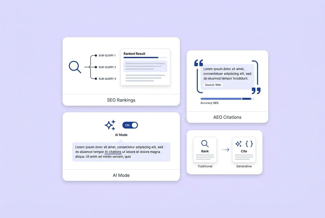
How Do You Structure Feature Adoption Pages for SEO + AEO So They Get Cited and Used?
Look, I know "optimizing for AI" sounds a bit gross, but it's really just about being clear, direct, and helpful. To win in search and get cited by AI engines, you need to write in extractable, claim-level blocks. AI doesn't read your article and summarize it; it pulls out individual paragraphs, lists, and tables that directly answer a query. If your first paragraph is just throat-clearing, the engine will skip you and find someone who gets to the point.
On-page structure for humans and robots:
- Use question-based H2s and H3s. "How do I connect my first integration?" is better than "Integration Setup" because it mirrors how real people search.
- Give a 1–2 sentence direct answer at the top of every section. Before you explain anything, give the answer. This is how you win featured snippets and get chosen by AI.
- Use numbered lists for workflows and bullet points for prerequisites. Keep it clean. Numbered lists mean the order is important.
- Add troubleshooting blocks. A small "Common issues" section is one of the highest-value things you can add. People in trouble search with terms like "why isn't X working," and these sections get found.
- Use tables for comparisons. They are consistently easier for both humans and machines to parse than a block of prose.
How to write "citation-ready" content:
- Define every key term in one clear sentence.
- Include conditions and limits: "This method works best when… / This won't work if…" Constraints make your content more trustworthy and specific, which AI engines love.
- Avoid vague openings. "There are many ways to approach this" is invisible to an AI. "The fastest way to do X is Y, assuming Z" is an extractable claim.
A simple internal linking strategy: Link from your high-traffic decision pages (like feature comparisons) to your trial guides. Use consistent anchor text so search engines understand the relationships. An adoption page with no internal links is an orphan; it won't rank, and it won't help anyone.
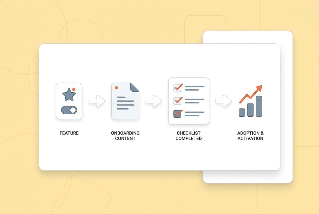
How Do You Measure Whether Feature-Led Content Is Driving Adoption (and What Do You Fix When It Doesn't)?
If you're still looking at pageviews to measure this stuff, we need to talk. Measure adoption content like you would measure a product feature: define the key activation event, track the user's path, and iterate based on where they drop off.
I once had a post get 50,000 pageviews in a month. We celebrated. Then we realized it drove exactly zero new activations. It was the wrong metric. Pageviews tell you if you got found. They don't tell you if you helped.
The metrics stack that matters:
- Content engagement: Are people actually reading? Look at scroll depth and time on page. Are they acting? Look at the click-through rate on your in-content CTAs.
- Activation: Did users actually complete the key event this content was designed to drive? Did they finish the setup? Create their first project? Connect their first integration?
- Retention proxies: Does the group of users who read this content retain better after 30 or 60 days? Do they use the feature more often? This is harder to track but it’s the most meaningful signal you have.
- Funnel attribution: Track assisted conversions for trials and upgrades that came from content. Be humble about attribution; last-touch models are a lie. Assisted conversion tracking is more honest about content's role.
How to run the iteration loop:
- Define the one success event for this asset (e.g., "first report created").
- Map the path: content → next click → in-product step → activation.
- Find the biggest drop-off point in that path.
- Update the asset. Add the missing prerequisite, rewrite a confusing section, add a screenshot, or build a troubleshooting block.
- Re-measure after 30 days.
What to fix when it’s not working:
- Wrong feature. You can't force adoption of a feature nobody needs. If the content isn't working, go back to your prioritization score.
- Wrong audience. If you wrote a guide for admins but end users are finding it, the steps won't work for them. You need to segment.
- Too hard to execute. The most common failure is missing prerequisites or skipping a crucial step. Go back and add them. Be painfully explicit.
- CTA mismatch. A "book a demo" button on a setup guide is just confusing. Match the action to the moment.
- Poor distribution. If your helpful guide is buried on the blog and not linked from your onboarding emails or in-app resource center, nobody who needs it will ever see it.