
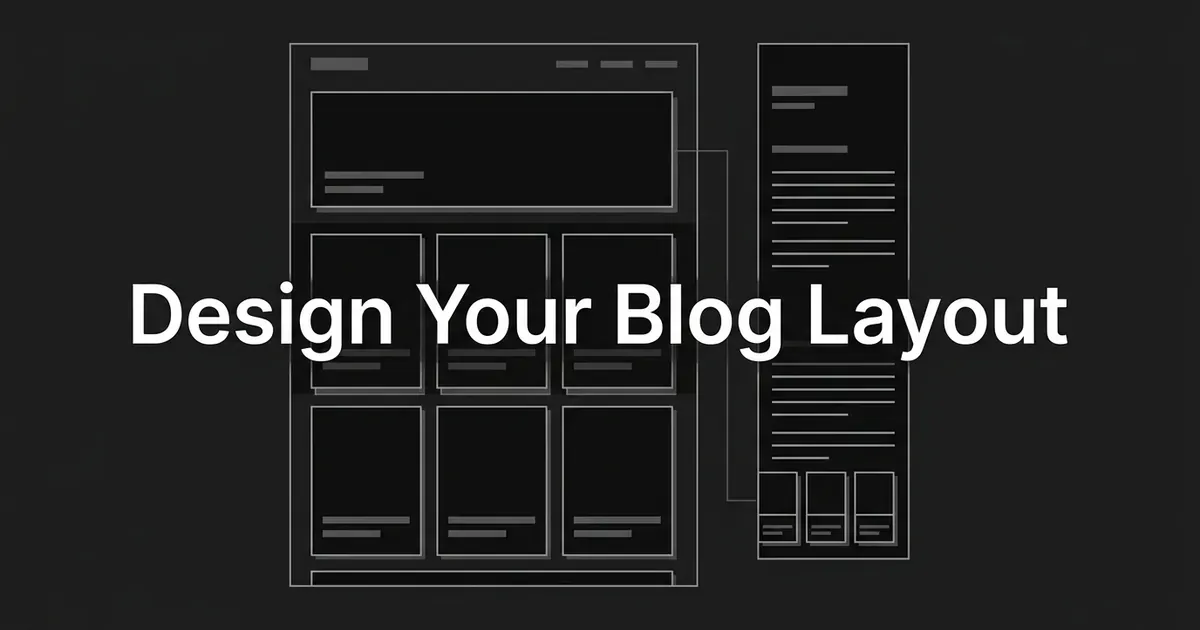
If your company already publishes useful articles, but the blog homepage makes them hard to find or the post template leaves readers at a dead end once they finish, this guide is for you. It shows you how to design a blog homepage and a post layout as a pair, so a first-time visitor can tell what your blog covers, pick something relevant, read it comfortably, and find a sensible next step. By the end you'll have a plan you can hand to a designer or build in the site you already have. It picks up after your platform is chosen, so we'll stay on how the pages look and behave.
What you need before you start is your logo, your brand colors and fonts, a few real articles to test with, and a rough idea of the questions your readers come with. A pen and paper, or a simple wireframing tool, will do for the first step.
One thing to say up front. Nobody can promise that a particular layout will raise your engagement, and this guide won't make that claim. What it gives you is a set of blog design best practices you can check yourself, each with a way to tell when it's done and the mistakes people tend to make along the way.
Step 1: Map the two journeys before you draw anything
A company blog has two front doors. Some people arrive at the blog homepage and browse. Others land straight on a single post from a search result or a shared link, and they may never see the homepage at all. It's easy to design only for the first group because the homepage is the page your team looks at most, so it helps to plan for both on purpose.
Start by sketching each path on its own. For the person who arrives at the homepage, write down the first question in their head, the main thing they'll want to do, and what they'll reasonably do next. A visitor looking for articles about marketing operations, for example, needs to recognize the subject, compare a few titles, and open one. For the person who lands on a post, the first question is whether this is the right article, then they want to read it without friction, and then they want somewhere useful to go when they finish.
Next, take stock of what you already have to work with: your logo, your main site navigation, the kinds of articles you publish, the images you use, any newsletter offer, and the questions readers most often bring. Then draw a rough homepage and a rough post page in low fidelity, just boxes and labels, before you think about colors or fonts. It's much easier to move a box than to redo a finished design.
How to tell it's done. Each sketch shows where a visitor can tell they're on your blog, find an article that fits them, get back to the rest of your site, and keep going after they finish a post. Check the two routes separately, since they fail in different ways.
Common mistake. Arranging the homepage around what your team wants to promote this month instead of the choices a reader is trying to make. These two journeys are planning prompts, so treat them as a way to ask better questions and not as a claim about how every visitor behaves.
Step 2: Set up a branded visual system
This is the step where most of the work on how to make your blog unique actually happens, and it's less about decoration than it sounds. A blog feels like yours when the same type, colors, spacing, and image style show up in the same way on every page.
Start with what your company already approves: typography, colors, logo treatment, illustration or photography rules, and the way you write. Then turn those into a small set of repeatable pieces. That usually means the homepage hero, the article card, a section label, a button, the post heading, a pull quote, and the cover image. When you build each of these once and reuse it, a new article only needs its content dropped in.
For the layout underneath, use alignment and a responsive grid, and save your strongest contrast and largest type for the most important choice on the page. Leave more whitespace between distinct groups than you leave inside a group, so people can see what belongs together. Nielsen Norman Group describes grids, visual hierarchy, intentional color, and consistency as the foundations of usable visual design, and it suggests limiting how many type sizes you use. That last point is a rule of thumb, so don't treat it as a required three-size system.
If you want to know how to make your blog unique without hurting how easy it is to use, keep the brand cues recognizable and let the content carry the variety. Your palette, typefaces, illustrations, and the stories you choose to feature can all say something about your company, while menus, titles, and buttons stay in the places people expect them.
DeepSmith can help with one part of this. Deep IQ stores your products, personas, voice, and brand rules as structured context, and it includes visual guidelines for on-brand covers, so the articles and cover images we produce for you start from the same brand context each time. The homepage and post template themselves are still design decisions for your team, and DeepSmith doesn't build or deploy them.
How to tell it's done. A homepage card, an article page, and a cover image look like they came from the same company. Turn the images off and the page should still read in a clear order, from title to body to secondary content. A practical check is to put these pieces next to your main website and see whether they match.
Common mistake. Confusing unique with cluttered. Novelty typefaces, brand colors with low contrast, and a different design for every post all make a blog harder to read, and none of them make it more memorable.
Step 3: Make the homepage purpose and navigation obvious
When you work out how to design a blog homepage, the first job is to say what the blog is. Put a recognizable blog title or a short statement of what it covers near the top. Keep a clear route back to your company site, a visible way to reach recent articles, and simple browsing choices once you have enough articles to need them.
If you add search, make it look like search for the blog, so it doesn't read as a decorative icon that people scroll past. On desktop, show your most important navigation labels rather than hiding everything behind a menu. On mobile, a collapsed menu is normal, so the goal there is that it's labeled, easy to operate, and easy to reopen. Make sitewide navigation look different from blog browsing, so people can tell which one they're using.
Nielsen Norman Group's research on desktop navigation is a good reason to take this seriously. In one study, an especially hard-to-find menu was used by 17% of participants, compared with a 42% average across the desktop navigation designs they tested. The menus differed in size, placement, and context, so this isn't a number to expect on your own blog. It does show how much a control's visibility can change whether people use it. The same research notes that context and expectations matter too, and it doesn't say a hamburger menu is bad on small screens.
How to tell it's done. Someone who has never seen your site can say what the blog covers and find a plausible article without opening several unclear menus first. Test your labels with real article titles, and ask people to guess where each control will take them before they click.
Common mistake. An icon-only menu for the main choices on desktop, labels that could mean anything, or a search box so quiet that nobody notices it.
Step 4: Arrange the homepage as a selection page
A blog homepage works best when it helps someone choose. That usually means a small featured section, either one story or a short editorial selection, followed by article summaries that are easy to scan. Of all the blog layout tips for this page, this is the one that changes the most.
Give each card a clear title, a short description where it helps, and an image only when the image helps people recognize the story. Make it obvious that the card can be clicked. Use headings to separate the featured material from the recent material, so nobody has to guess why one article gets more space. If your readers browse by subject, give those subjects visible labels and decide how they look here. How the categories are organized behind the scenes for search is a separate question, and it has its own checklist.
Looking at real blog homepage design examples helps a lot at this point. HubSpot's blog homepage, for instance, labels one section Featured Posts and shows article titles along with author and updated-date information below it. That's a useful pattern to look at, because the highlighted picks are separated from the rest of the articles. It doesn't prove that this exact design is the best one, and your blog doesn't need the same modules. Pick two or three blog homepage design examples from companies your readers also follow, note what each one puts first, and use that to shape your own wireframe.
There's some research behind the idea of summaries over full posts. In Nielsen Norman Group's eyetracking examples of corporate blog front pages, people on pages that showed a full post often stopped at that first post, while people on summary-based pages looked at more options. That supports summaries as a sensible default for a company blog. It doesn't show a set lift in clicks, and it doesn't give you an ideal number of cards. The research also notes that a blog people revisit for the newest full post can be a different case.
Pro tip. Treat the featured spot as an editorial decision that someone reviews on a schedule. A featured story that never changes turns into a stale banner, and the team should be able to say why it earned the larger space.
How to tell it's done. A visitor can compare several genuinely different articles within the first screen or two, understands what each card opens, and can keep browsing without hitting what looks like a dead end.
Common mistake. Putting a whole first article on the homepage, letting a huge hero image push every other choice out of view, or using identical cards where the titles are hard to spot.
Step 5: Make the post template easy to read and scan
Once someone opens an article, the design has a different job, which is to support reading. Show the post title clearly, follow it with a short introduction, and use visible section headings so people can find their way around. Keep the text in a steady, comfortable column and don't let paragraphs run across the full width of a wide screen. Make sure the body text is easy to read, the contrast is strong, the background doesn't compete with the words, and the spacing between lines and paragraphs makes scanning comfortable.
Here are a few blog layout tips that hold up on most templates. Use lists, diagrams, or images when they show a relationship or an action that would take a long time to explain, and leave out images that only repeat the paragraph beside them. Keep share buttons, author details, and promotional blocks from interrupting the article. For long posts, a clearly labeled contents control can help, and it's worth adding once your testing shows that readers want one. If you'd like more on writing the posts themselves, our guide on writing a blog post AI answer engines cite covers the writing side, and this page stays with the layout.
It helps to keep three words apart. Legibility is whether people can tell the characters apart. Readability is about how complicated the wording and sentences are. Comprehension is whether readers understand what you meant. A good layout improves legibility and makes an article easier to scan, but it can't fix writing that's inaccurate or confusing.
This is another place where DeepSmith fits in a small way. Our production pipeline researches, drafts, optimizes, and illustrates an article, and then a person reviews and publishes it. That gives your post template something well built to hold, and it doesn't replace designing the template itself.
How to tell it's done. A reader can scan the headings to find a section, read several paragraphs in a row without losing their place, and tell what's article content and what's promotion. Review the template with the real length and formatting of your typical posts, because placeholder text hides problems.
Common mistake. Tiny type, a full-width column on desktop, a busy background, a giant header that pushes the first paragraph off the screen, or several competing calls to action.
Step 6: Give readers a relevant next move at the end of a post
The end of an article is where a lot of blogs let readers go. A reader who finished a post has just shown that they're interested, and the page should give them something good to do with that.
Show a small, clearly labeled set of related articles, and use specific titles that make it easy to see why each one is useful. Choose them by the reader's likely next question, not only by date or a shared tag. Place a newsletter signup or a product action where it follows naturally from the topic, and let it sit alongside the reading options so it doesn't replace them. Give people a simple way back to the blog as well. A next article and a trial invitation do different jobs, so it helps to give each one its own clear role instead of turning every article ending into a sales pitch.
Nielsen Norman Group has written about how related content can raise pageviews when it's done well, and it recommends offering relevant content or a strong action at the end of an article. This step is about what readers see and choose. The wiring behind it, such as how pages link for crawlers, belongs in its own checklist.
How to tell it's done. For each representative post, a reader who reaches the end can point to a useful next article or an appropriate alternative action. Click through the real destinations and read the wording on each card, since a mismatch there is easy to miss in a mockup.
Common mistake. Generic "You may also like" items picked without regard to the current article, duplicate cards, or a large promotional block that hides everything else.
Step 7: Check mobile, accessibility, and page stability together
Now look at the same homepage and post in three other ways. Open them at a narrow, phone-sized width, then again with the text zoomed in, and then using only a keyboard. You're checking that navigation, cards, and related-post controls still work, that the reading column reflows, that focus is visible, that headings and labels describe their controls, and that a sticky header doesn't cover whatever is in focus.
The WCAG 2.2 guidelines from the W3C give you concrete targets for this. At the AA level, ordinary text needs a contrast ratio of 4.5:1, large text needs 3:1, and interface components and graphics that carry meaning need 3:1. Content should reflow without routine horizontal scrolling at a width equal to 320 CSS pixels, and text should be enlargeable to 200% without losing content or function. You can read all of these in the WCAG 2.2 specification, including the exceptions, which are worth reading before you call any single control compliant or not. Test your actual color pairs instead of assuming the brand palette passes.
There's one line-length figure people often get wrong. The 80-character limit for a block of text comes from a Level AAA criterion, so it isn't a general AA requirement. It's still a handy check against lines that run too long.
Page stability matters too. Google's current Core Web Vitals thresholds for a good experience are a Largest Contentful Paint of 2.5 seconds or less, an Interaction to Next Paint of 200 milliseconds or less, and a Cumulative Layout Shift of 0.1 or less, measured at the 75th percentile of page loads and split by mobile and desktop. A polished mockup doesn't prove the live page meets them, so check the built page, especially if you add large hero images, custom fonts, carousels, or modules that load late. Reserve space for images so the content doesn't jump around as they load.
How to tell it's done. The page keeps a clear reading order at the 320 pixel equivalent width without routine sideways scrolling, text can go to 200% without breaking, essential controls show visible keyboard focus, and the color pairs you checked meet the standard you chose.
Common mistake. Reviewing only a desktop screenshot, assuming a minimal design must be accessible, putting text inside images where it can't be selected, or letting a sticky header cover the element in focus.
Step 8: Test the whole journey and fix the weak spots
The last step is to put the design in front of real people. Ask a few representative readers to do tasks without any coaching, such as finding a post about a named subject from the homepage, saying what the main point of a post is, and finding another useful article after they finish one. Watch where they pause, open the wrong menu, skip over a card, or mistake a promotion for navigation. Most blog design best practices turn out to be easy to check once real readers are in front of the page.
Nielsen Norman Group suggests around five participants for a typical qualitative usability study of one group of users. That's a planning guideline for finding many of the obvious problems, so it isn't a statistical sample, and it won't find every issue. If you have distinct audiences, you'll want to test each of them.
Next to the tests, look at how the live site is used: which homepage cards lead to posts, which onward articles get chosen, and whether people use the blog search. If you plan to read custom click events, define them before you interpret them.
How to tell it's done. Testers can complete every task, your team has a short, prioritized list of what got in their way, and you've checked the revised design on both the homepage and the post pages. Compare changes against the same tasks and the same kind of audience, so a nicer-looking screenshot doesn't get mistaken for progress.
Common mistake. Treating pageviews or time on page as proof that people are engaged, or treating scrolling as reading. Google Analytics enhanced measurement, for example, fires its standard scroll event when 90% of the page's vertical depth first becomes visible, which doesn't mean anyone read each paragraph. Change one module at a time where you can, so you know which change to credit, and set up separate measurement for related-post clicks if that decision matters to you.
What to do next
Pick one homepage and one representative post, and wireframe both this week. Run the two entry paths past a few people, watch where they slow down, and fix the weakest interaction first. Once the design is settled, you'll need articles to fill it. If you'd like help producing on-brand articles for the new layout, you can start a DeepSmith free trial and see what a finished, brand-grounded article looks like.