
Your citation rate is 4.2%. Is that good? You have no idea, and that's the whole problem.
A number on its own is just a number. An AI visibility dashboard that shows movement, flags the weird days, and tells you which engine slipped is an instrument. That's what you're building here. This guide is for you if your prompt set and your metric definitions already exist, and what you're missing is the reporting layer that turns collected answers into something you can act on.
If that feels like a big build, take a breath. The underlying math is arithmetic, and you can have something useful running this week.
By the end, you'll know what to capture, how often to refresh it, and how to lay out the views so a drop is debuggable instead of mysterious.
Step 1: Decide what your dashboard has to answer
Before you open a spreadsheet, write down the questions. A dashboard built without them becomes a wall of charts nobody reads.
Yours needs to answer four, and all four are about movement over time:
- How often does AI name your brand when buyers ask your prompts? That's mention rate.
- How often does AI link to your pages as a source? That's citation rate.
- Of all the citations handed out across your prompt set, what share goes to you versus competitors? That's share of voice.
- Are those numbers improving, holding, or dropping, and where are the spikes that need a human?
Notice that the fourth question isn't really a metric. It's the lens you put on the first three. Miss it and you've built a report, not an instrument.
Why track AI citations over time instead of pulling a number when someone asks? Because a single reading can't tell you the difference between a trend and a Tuesday. Engines rewrite their answers constantly. Your competitors publish. The only way to know whether you're gaining ground is to have the last eight weeks sitting next to today.
There's a second reason, and it's the one that surprises people. Roughly 65% of AI search sessions end without a click to anyone's site. Your analytics won't show you this channel at all. If you don't monitor AI visibility deliberately, you are not measuring it slowly. You are not measuring it.
You'll know this step is done when you can say out loud what decision each chart supports. If a chart doesn't change what you'd do on Monday, cut it.
Where people go wrong: they build the snapshot first and promise themselves they'll add trend lines later. Later never comes, because the historical data was never being stored. Decide now that every row you keep is timestamped.
Step 2: Lock your metric formulas before you build anything
Here's the good news: the math is simple. The discipline is in writing it down and never quietly changing it.
Mention rate is the share of collected answers where AI names your brand in the text the user actually sees:
Mention Rate = (Answers naming the brand) / (Answers collected) × 100
Citation rate is the share of answers that include at least one URL on your domain:
Citation Rate = (Answers with ≥1 brand-domain URL) / (Answers collected) × 100
Share of voice is your slice of all citations handed out across your tracked answers:
Share of Voice = (Citations to your domain) / (Total citations across tracked answers) × 100
Now the edge cases, because this is where dashboards quietly go wrong.
Misspellings still count as mentions. If you match on exact string equality, you'll undercount every time an engine drops a hyphen or adds an s. Use case-insensitive matching plus the common variants.
Negative framing counts too. "Unlike Acme, Brand X does Y" registers as a mention in naive math. Most teams accept a few false positives rather than undercount. Either choice is fine. Just write down which one you made.
Decide whether subdomains roll up. Your blog and your main site are usually one entity. Your docs might not be. Pick a convention and keep it.
And one that bites people later: an answer citing you twice counts once for citation rate, but twice for share of voice math. Document that, or two charts will disagree and you'll spend an afternoon finding out why.
You'll know this step is done when a teammate could recompute last week's number from your definitions and land on the same figure.
Step 3: Choose your path, build or platform
Both paths are legitimate. The right one depends on your prompt count, your budget, and whether you want to maintain scrapers.
Build your own if you're tracking under roughly 40 prompts, you're on a tight budget, you run a single brand, or you have data residency rules that make a vendor awkward. You'll need some engineering appetite.
Use a platform if you're past that prompt count, you run multiple brands, you need SSO and SOC 2, or you'd simply rather your team spent its hours on content than on keeping a scraper alive when an engine changes its interface.
There's no moral high ground here. The build path costs engineering hours and buys you total control. The platform path costs money and buys those hours back. Both produce the same charts.
Be honest about the DIY failure modes before you commit, though. Token costs drift upward as your prompt set grows. Rate limits truncate data quietly rather than loudly. An engine ships a UI change and your scraper breaks overnight. And timezones will make "daily" mean two different things to two different readers of the same chart.
If you're building, the shape is six phases. Take the prompt set you already have and record each prompt with its brand, top competitors, and intent tag. Hit each engine on a schedule, capturing the full answer and the full source list in order. Land it all in a data layer. Put a dashboard on top. Validate everything.
Feeling like that's a lot? It is. That's an honest reason to buy rather than build, and it's the reason most teams past 40 prompts do.
Pro tip: whichever path you pick, capture the full answer text and the complete source list, not just a yes/no flag. Substring scraping silently drops citations, and you can't backfill a field you never stored. Storage is cheap. Re-running three months of history is not.
Step 4: Build the data layer everything sits on
Your dashboard is only as good as the tables underneath it. Three of them do the job:
- An answers table. One row per date, prompt, engine, brand detection, and citation detection.
- A citations table. One row per cited URL per answer.
- A competitors table. One row per competitor result.
Every chart in this guide comes from those three. That's it.
Now the part that separates a dashboard people trust from one they quietly stop opening. Tag every row with its prompt, engine, timestamp, and run ID before it lands. Validate the JSON on every response. Escape your strings, because AI answers are full of quotes, newlines, and curly braces that will wreck a naive CSV parser.
Shard the work into parallel batches. Make the jobs resumable, so one engine timing out doesn't wipe a whole run.
Skip the tagging and validation and your dashboard will show wrong numbers for weeks before anyone notices. That's the failure mode to fear. Not a crash, a lie.
If you'd rather not build and maintain this layer, it's the part a platform genuinely takes off your hands. DeepSmith runs collection on a schedule against the questions you define, then reports mention rate, citation rate, and share of voice with trends, a per-platform breakdown, a competitor leaderboard, and the sources AI cites most. Engine coverage runs across ChatGPT, Perplexity, Gemini, Claude, and Google AI Mode, and which of those you get depends on your plan tier. Either way, the metric definitions from Step 2 are still yours to own.
You'll know this step is done when you can trace any single number on any chart back to a specific run ID.
Step 5: Set a refresh cadence you can actually act on
More data isn't better. Data matched to a decision is better.
Daily works for your main set of roughly 20 to 50 prompts. You'll catch volatility and get faster alerts, and you'll pay for it in tokens and scrape budget.
Weekly suits an extended set of 50 to 150. Less noise per point, roughly half the cost, and you'll miss short-lived swings.
Monthly is fine only for slow-moving niches. A jump from 4% to 7% in a month looks dramatic, and you'll never know whether it happened on day 2 or day 28.
The recommendation that holds for most teams: daily on your core prompts, weekly on the extended set, monthly only where the market genuinely doesn't move.
Common mistake: collecting daily when you only review monthly. You're paying daily prices for monthly insight. Match the cadence to the decision, not to your anxiety.
One more cadence rule that saves grief later. Whatever you pick, keep it stable. A metric collected daily for six weeks and then weekly for six weeks produces a line with a seam in it, and the seam will look like a trend to everyone who wasn't in the room when you changed it.
Step 6: Lay out the views in priority order
Now the fun part. Build these in this order, because the first three earn the dashboard its keep.
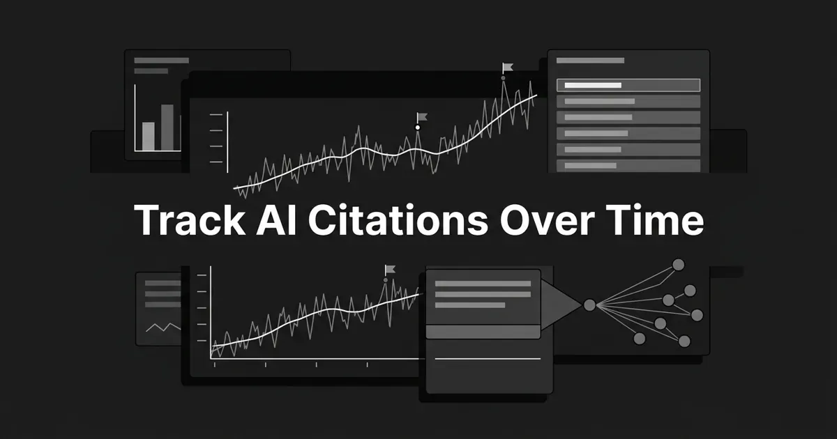
1. The big trend line. Mention rate, citation rate, and share of voice plotted across 30, 60, and 90-day windows, with an engine toggle. Always overlay a moving average, 7-day or 14-day, on top of the raw daily line. Daily points are noisy. The average is what makes them readable. This single chart is most of the reason you track AI citations over time at all, so give it the top of the screen and plenty of room.
2. Per-engine small multiples. One mini-chart per engine. A drop on a single surface is invisible once you flatten everything into one line, and engines behave very differently. Perplexity and Copilot cite external sources in roughly three-quarters of their answers. ChatGPT does it closer to a third of the time. Averaging those together produces a number that describes nothing.
3. Competitor leaderboard. A table sorted by share of voice, with 7-day and 30-day deltas. This is the screenshot you'll paste into Slack most often. Make it good.
Here's the encouraging part of that chart: most B2B brands hold under 30% share of voice on AI engines. Nobody has locked this up. You're looking at a contested race, not a closed one, and your leaderboard is what tells you which prompts are winnable.
4. Top cited sources. The URLs AI cites most for your prompts, ranked by citation count. Some will be yours. Many won't, and that list is your content roadmap.
5. Volatility markers. Any day where a metric moves more than two standard deviations from its 14-day mean gets a visible flag, with a tooltip naming the run ID and the prompt affected.
6. Prompt-level breakdown. A sortable table of every tracked prompt with its current mention and citation rates, clicking through to that prompt's answer history.
7. Drop attribution. When the headline line falls, the view decomposes it: which engine dropped, which prompt dropped, which competitor rose.
Those last two are what turn an AEO dashboard from a reporting surface into a debugging surface. Most dashboards stop at chart three. Yours shouldn't.
Step 7: Flag volatility so you can tell noise from signal
AI engines are non-deterministic. The same prompt, same engine, same day can return different answers minutes apart.
Read that again, because it's the single fact that breaks most AI citation tracking dashboards. A single daily point will produce phantom drops. Someone will screenshot one, panic, and spend a week chasing a change that never happened.
This is also why an AI citation tracking dashboard shouldn't borrow its habits from rank tracking. There's no stable per-URL position in an AI answer the way there is in a list of blue links. Same query, same engine, different user, different answer. A dashboard that reports a confident "position 3" is decorating variance with a number.
Two things fix it, and neither is hard.
Overlay the moving average. The raw line shows what happened, the average shows what's true.
Then flag the real outliers. The two-sigma rule from Step 6 does this cheaply. Anything past that band gets marked, and the marker carries its run ID and prompt so a person can drill in.
Where people go wrong: a flag whose tooltip says "something changed" is worse than no flag. It creates alarm without a next step. Carry the context or don't carry the marker.
Step 8: Make every drop debuggable
Your dashboard's real job is answering the question you'll get asked in every review: "why did it go down?"
A drop has a small number of possible drivers. A competitor published something better. The engine changed how it cites. Your pages lost relevance. Or your prompt set shifted underneath the number.
Four candidates. That's it. A dashboard that can rule out three of them in a couple of clicks has done its job, and the reason you built the tagged data layer back in Step 4 was to make exactly that possible.
The shifting prompt set deserves a rule of its own. When you add or retire a prompt mid-period, the share of voice line breaks at that point. The pre and post periods aren't comparable anymore. Mark the change point on the chart. Never let two different prompt sets sit on one continuous line pretending to be the same measurement.
One more attribution trap. When an AI answer cites a third-party page that quotes you, the citation belongs to that third party's domain, not yours. Roll it up to your brand and you'll inflate your own share of voice, which is a comfortable lie your dashboard should refuse to tell.
You'll know this step is done when you can go from "the line dropped" to a named engine, a named prompt, and a named competitor in under two minutes, without opening a database.
What to do next
Start smaller than you think. Take ten prompts, one engine, and a spreadsheet, and get a trend line with a moving average on it this week. That's a real AEO dashboard. Everything else in this guide is an upgrade to it.
Add the second engine once the first is boring. Add competitors once you trust the metric. Add drop attribution once someone asks "why" and you can't answer.
You're closer than you think. The teams who monitor AI visibility well aren't the ones with the prettiest charts. They're the ones who wrote their definitions down and kept the history.
And if maintaining scrapers isn't how you want to spend the next quarter, that's a legitimate call, not a cop-out. DeepSmith tracks the prompts you define across AI engines and reports mention rate, citation rate, and share of voice with trends and a competitor leaderboard, with a 7-day free trial if you want to see your own data before you decide. Start a free trial and point it at your prompt set.
Either way, keep the history. Future you will need it.