
Most SaaS content plans treat every asset like a blog post: write it, publish it, hope it ranks. But a calculator does a different job than a comparison page, and a comparison page does a different job than a changelog. Each one earns its place by answering a specific question at a specific point in the buyer's thinking, not by filling a content calendar slot. This is what the SaaS lead funnel content types below have in common: they are functional first, editorial second, and the reader can tell within seconds whether the page is actually useful to them.
You do not need every format on this list. You need the ones that match where your buyers actually get stuck. Below is a working set of content types for SaaS funnel stages, what each one should contain, and the point where it stops being useful and starts being decoration. Functional content SaaS teams build this way does one job at a time, and it works because the reader can tell within seconds whether that job is actually getting done.
Calculators and Interactive Estimators
A calculator can sit at any stage, and the stage depends on the question it answers, not on whether it has a slider. A problem calculator that estimates how much time or money a workflow is costing fits awareness, because it helps someone size up a problem they had not quantified yet. A planning calculator that lets a visitor test scenarios fits consideration. An ROI, TCO, or payback calculator fits decision, because its whole job is helping a buyer build a business case for someone else in the company.
Whatever the stage, the mechanics stay the same: a small number of plain-language inputs, an immediate result, and a visible explanation of the assumptions behind it. If the tool produces an estimate, say so. If it uses defaults, let the visitor change them. The biggest failure mode is asking for an email address before showing any value at all, which turns a useful tool into a lead form wearing a costume.
Measure starts, completion rate, and what happens after someone sees their number. For a decision-stage ROI or TCO calculator, also track whether people export or share the result, since that is a sign it is being used inside a real buying process rather than browsed once and forgotten.
Templates, Checklists, and Planners
Templates and checklists do their best work early, at awareness and the start of consideration. They take a fuzzy problem and turn it into something the reader can act on immediately: an audit checklist, a planning worksheet, a scorecard, a procurement-question list. The good ones encode a real workflow. The bad ones repackage a blog post as a PDF and call it a lead magnet.
A checklist should help someone confirm whether a condition is true. A template should help them produce something reusable. A planner should help them sequence work. Keep those three separate, because a document that tries to do all three usually does none of them well.
Give the reader the complete artifact, not a partial one that requires a sales call to unlock the rest. Explain what it cannot decide for them, since a template that pretends to remove all judgment from a decision is not being honest about what it is. From there, hand off to something more specific: a related assessment at awareness, or a relevant use case or demo once the reader has moved into consideration.
Quizzes and Qualification Tools
A short quiz or assessment sits between awareness and consideration, and it earns its place by helping the reader identify which path applies to them. It works when the result changes based on the answers, not when every visitor lands on the same generic recommendation regardless of what they entered.
Ask only questions that actually change the outcome. If a question is not obvious, say why you are asking it. Give the visitor something useful, a score, a recommendation, a next step, before you ask for contact information, and let them correct answers rather than locking them into a first guess.
Route different results to different resources. Someone who scores as early-stage should land somewhere different than someone who scores as ready to buy. Track completion, the distribution of answers, and what people do after they see their result. A high completion rate on its own tells you almost nothing about whether the assessment is actually improving pipeline.
Interactive Demos and Product Tours
An interactive demo is a self-guided walkthrough that lets someone explore a product without booking a call or waiting for a sales rep. It mainly earns its keep at consideration and decision, though a short, problem-oriented preview can spark curiosity earlier. Because it is usually a controlled replica rather than the live product, be upfront about that so the visitor is not confused about what they are looking at.
A good demo opens on a clear scenario, gets to the most important workflow quickly, and explains outcomes rather than just narrating buttons. One vendor's analysis of B2B SaaS interactive demos found them present on 18 percent of the sites it studied, up sharply from the year before, and found that a majority of the top-performing demos in its dataset were ungated. Treat that as one company's read on its own data set, not a universal law, but the underlying point holds: showing value before asking for a form tends to work better than hiding it.
Support mobile, since a demo that breaks on a phone undermines the whole evaluation. Track click-throughs into the workflow, time in the demo, and whether it leads to a trial or a live conversation. A demo with no ownership tends to drift out of sync with the real product, which does more harm than not having one at all.
Use Case and Industry Pages
A use case or industry page answers a narrower question than the homepage: does this actually fit my workflow, my team, my industry? It belongs at consideration and decision, and it only works when it carries real operational detail instead of swapping in a new headline over the same generic feature list.
A page like this needs the audience it is for, the problem in their specific environment, how the workflow actually plays out, and what proof exists that it works. Include the objections a skeptical reader would raise and answer them directly, rather than leaving that reader to find the catch on their own later.
Do not build one of these for every persona and keyword combination you can think of. A smaller set of well-built pages beats a long list of thin near-duplicates that all say the same thing with a different noun swapped in. Measure demo requests, trial starts, and influenced pipeline from each page, not raw traffic, since traffic alone tells you almost nothing about whether the page is doing its job.
Integration Pages and Directories
Integration content answers a specific, high-friction question: will this work with what we already have? That makes it a consideration and decision asset before purchase, and a retention and expansion asset after it, once customers are looking for more ways to connect the tools they already pay for.
A single integration page should explain what the two systems do together, what data or workflow moves between them, what setup takes, and where the limits are. A directory is the browsable layer on top, organized by category so a visitor can scan for the systems they care about. A 2024 survey of B2B SaaS professionals found integrations came up in 60 percent of sales deals and that the large majority of respondents considered them very important or a must-have, though it also found a meaningful share of companies could not say whether integrations affected churn one way or the other, which is a reason to treat that connection as directional rather than settled.
The common failure here is a wall of logos with no explanation of the actual workflow behind them. A logo is not proof that a connection is useful. Keep pages current and pull the ones for integrations that no longer work, since a broken promise here damages trust in everything else on the site.
Comparison and Alternative Pages
Comparison and alternative pages are late-stage decision content, built for a reader who has already named a competitor or a category and is actively choosing between options. They only need to appear once here as one format among many, but they are worth getting right because they carry real risk when done badly.
A useful comparison page answers the question directly near the top, walks through the handful of criteria that real buyers actually weigh rather than every feature either product has, and gives an honest account of where each option is genuinely stronger. Conceding a real point in the other direction is what makes the rest of the page believable. Vague, one-sided pages read as marketing rather than research, and readers notice.
Keep these pages current. Pricing, features, and claims change, so give each page an owner and a scheduled recheck rather than letting it go stale. Measure trial starts and demo requests from organic visitors within a defined window, separate from top-of-funnel traffic, so the page's real contribution does not get blended into a number that hides how it actually performs.
Migration and Switching Pages
A migration page exists for a narrower reader than a comparison page: someone who already wants to switch but is worried about the disruption of actually doing it. The real concern here is operational risk, not features, so the page has to answer what could go wrong, how that risk gets reduced, and what the realistic path from where they are now to a working setup actually looks like.
Include the scenarios you support, what moves first, what the timeline tends to look like, and who owns which part of the process. Be specific about downtime and rollback options rather than promising a smooth switch and leaving the details vague. A migration page that skips the hard parts reads as a sales page wearing a different label, and a careful reader will notice the gap immediately.
This is one of the few formats where proof matters more than persuasion. A short, specific account of how a similar switch actually went does more work here than another paragraph about ease of use.
Pricing and Packaging Pages
By the time someone reaches your pricing page, they usually want fast, specific answers: cost, what is included, billing terms, and what happens if they outgrow a plan. This is decision-stage content, and it fails when it makes people work to find basic facts.
Publish clear plan names and prices wherever you can. Explain what each tier actually enables in outcome terms, not just a feature checklist, and label plans by the audience or use case they fit best. Keep the comparison between tiers to the differences that actually matter, and make the trial, demo, or contact-sales path obvious rather than buried.
Track plan-selector interactions, clicks into each path, and how many of those turn into trials or qualified conversations. Be careful with borrowed statistics here. A number from someone else's pricing page, with no sample size or date attached, is not a benchmark you can build a decision on.
Security and Trust Centers
For enterprise and regulated buyers, a trust center is decision-stage infrastructure. Its job is to let a security or procurement team evaluate risk on their own timeline, without needing a call just to see a certification.
Buyers evaluating a vendor tend to look at the same handful of things: security posture, compliance evidence, how data is actually handled, incident response, and operational reliability. A trust center should lay all of this out clearly, with certifications given real context instead of listed as logos, and with a straightforward way to request anything that needs to stay restricted.
The common mistake is gating basic information behind an NDA or a sales call, which tells a careful evaluator that something is being hidden even when nothing is. Keep the page current, since stale security information is worse than none, and link to it from pricing, comparison, and migration pages wherever a buyer's risk questions are likely to surface.
Documentation and Changelogs
Documentation and changelogs belong to a different part of the journey than everything above. Most of this list is built to help someone become a customer. These two are mainly built to help someone who already is one succeed, and it is worth being honest about that rather than forcing them into an acquisition stage where they do not really fit.
Documentation's main job is helping a new or existing user complete a task without getting stuck: a quick-start path, task-based instructions, prerequisites, and a clear place to go when self-service does not work. A changelog's job is telling customers what changed, who it affects, and what they need to do about it. Dynatrace's public release notes are a workable model: a regular rollout cadence, a plain description of what changed, and enough detail that a reader does not have to guess. Both formats can offer some reassurance to a technical evaluator earlier in the process, since active, well-documented products read as lower risk, but that is a side benefit, not the reason either format exists.
Measure documentation by task completion and support deflection, not pageviews. Measure a changelog by whether customers actually read and act on the updates that affect them. A changelog that turns into a promotional feed with no practical detail has stopped doing its real job.
How to Prioritize Across These Formats
Start with the question your buyers actually get stuck on, not the format that sounds most impressive to build. If people are dropping off because they cannot tell whether the product fits their workflow, a use case page beats another blog post. If deals are stalling on integration questions, an integration page or directory does more than a general feature list ever will.
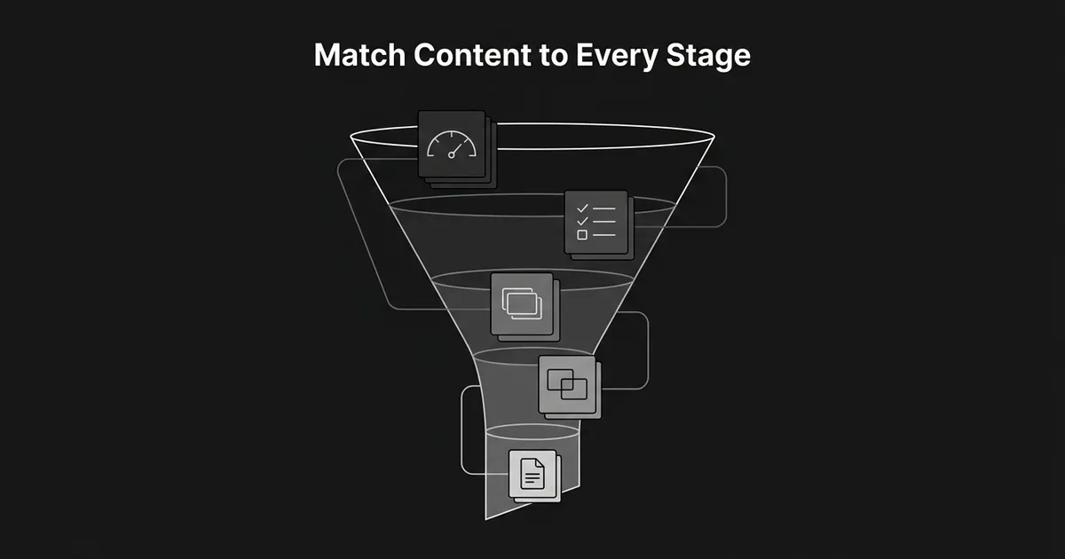
Match the call to action to the stage the format serves. Early on, that is trying a tool, saving a result, or getting a template. In the middle, it is exploring a use case, an integration, or a demo. At decision, it is starting a trial, requesting a demo, or getting pricing. After the sale, it is finishing onboarding or reading about what is new.
Every format on this list turns into a liability once it goes stale. A pricing page with old numbers, an integration page for a connection that no longer works, a comparison page with outdated claims: each one damages trust more than having no page at all. Give each format an owner and a review cadence before you publish it, not after something goes wrong.
Treat this as a working set of SaaS lead funnel content types, not a checklist to complete in order. A five-person marketing team gets more from doing three or four of these well than from building all eleven at once and maintaining none of them properly. Pick the formats tied to the friction you can already see in your funnel, ship those first, and add the rest only once the ones you have are actually being used and kept current.